Bad logo designs can be the worst nightmare for any business. The most important features of a logo design should be uniqueness, attractiveness, and effectiveness, and if it is lacking that, then the logo is useless. A logo represents the identity of your brand or business; it must be distinctive.
It should not only include some snappy and eye-catching aspect that will draw people’s attention to it, but it should also have some novel and clever notion that will pique their interest. It should also be capable of communicating and delivering the message as effectively as the creator planned.
Our extensive research will cover all you need to know about how to recognize bad logo designs and avoid them in 2023.
What Are the Characteristics of a Bad Logo Design?
When it comes to logo design, certain characteristics can make a design fall flat and fail to effectively represent a brand. From inexperienced design choices to the misuse of clipart and stock images,
The following are the main characteristics of bad logo designs:
- Inexperienced design
- Most brands focus so much on new technology that they lose sight of their primary goals.
- They frequently contain out-of-date clipart and stock images.
- Some designers see no harm in merely changing a logo from someplace else, but in truth, they are losing the originality of the brand’s identity.
What Makes a Bad Logo? How to Recognize and Avoid It?
![]() The following are the main traits to recognize bad logo designs that can ruin your brand image and identity:
The following are the main traits to recognize bad logo designs that can ruin your brand image and identity:
1# Ancient Designs:

The most common thing you will notice in a bad logo is they have very outdated images and unappealing colors.
The best thing you could do with that is to redesign it. If you have an out-of-date logo, the best answer is to redesign it by hiring the best logo design agency.
Retro design is certainly popular. However, if you want a logo with a vintage feel, do it deliberately. Only contemporary vintage design components should be used.
2# Too Complex:
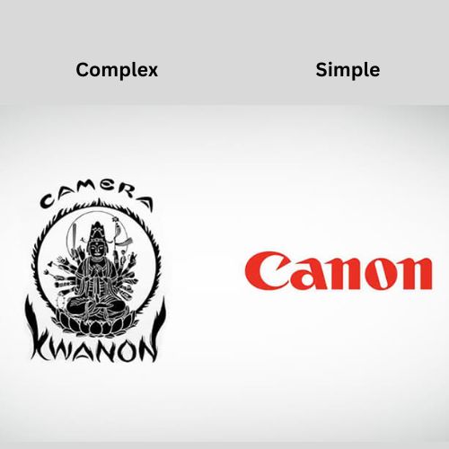
Another error that designers and businesses make is oversimplifying their logos. You still use a single logo to convey a complicated message to potential buyers. Don’t count on your audience to constantly fill in the holes.
If anybody looks at your logo and is confused or has difficulty putting the pieces together, you haven’t done your job.
Aim for a straightforward design that does not lose sight of its goal. Don’t be scared to provide details you don’t need many to convey your message.
All it takes are a few basic details in the image’s typeface, color, and spacing to convey your company’s mission statement.
3# Bad Fonts:

Another common trait of bad logo designs is that they chose the wrong fonts for their logos. Excessive font use could make your brand appear unprofessional and unaesthetic. It is not rare for a logo to fail due to a bad font selection.
Fonts, like all businesses, have distinct personalities. You should select the appropriate font personality for your company’s brand.
A hand-drawn typeface, for example, will have a distinct mood and express different features than a serious, strong font. Spend some time studying typefaces that are appropriate for your company’s style.
Don’t be scared to experiment with other fonts or adapt them to suit your needs. You could even come up with your own!
4# Contradictory Themes:
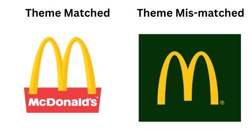
Just imagine a logo full of crocodiles and beasty creatures as the logo for a peaceful star gazing program in the fields.
Isn’t that an odd choice of themes? Well indeed it is and that’s why it is in the bad logo designs pile. Consider using relevant iconographies, such as wire circuits or astral grids, to communicate your brand principles.
The problem arises when themes clash, and you create the wrong impression of your brand. Your graphics and artistic style should both reflect your branding aims.
Using widely known symbols with your target audience’s chosen themes is a quick way to communicate effectively.
5# Wrong Choice of Colour Scheme:

Bad logo designs don’t have a balance color scheme. Finding the proper color balance in your logo may be just as important as choosing the right typography.
If your colors do not complement your company’s message, or if the color combination does not work, your logo will appear clumsy and unprofessional.
To begin, the easiest method to prevent this problem is to eliminate color. This does not imply that your logo should be colorless, but it may be a good idea to start with black and white.
Once you have developed a compelling concept and design, it is time to add color. By then, you will have decided on the form of your logo and what message you want to convey.
6# Cliched Logos:
The same duplicate types of logos are a big no-no. When logos are remembered, they are most effective. Generic logos, on the other hand, that follow the same trends and patterns as everyone else, have the opposite impact.
If you do what everybody else is doing, there’s a strong probability that your brand may be confused with another. The idea behind generic logos appears to be a straightforward copy of the logos that people obviously like.
However, the market becomes swamped with logos that all perform the same thing within a few months or years. Logos that were originally one-of-a-kind have become commonplace.
The greatest method to avoid generic logos is to keep up with the activities of everyone else. Generic logos are typically fine at first, so you may not want to forsake all trends just yet. Be sure to include something unique.
7# Uncertain Purpose:
There is an underlying feeling of the intention behind the text, picture, and color. The visual style conveys to visitors your company’s beliefs, purpose, and emotional connection to the product.
A logo for an airline, for example, might have a distinct emotional aim than a design for a food bank. Customers will associate your logo with the company’s primary goal, so make sure they complement each other nicely.
If your business is all about fashion trends, choosing something powerful, aggressive, and edgy will appeal to your target demographic.
On the other hand, something calm and trustworthy will be a better fit for customer service. Consider the visual brand that you’re attempting to develop for your organization.
Evil logo designs might sabotage the image you’re attempting to develop for your company.
Logos are the first point of contact consumers have with your company, and they are sometimes the sole indication of your quality, services, and professionalism.
It is critical to precisely have the right design aspects, from relevant to being dated, to create a memorable and successful logo for your business.
Conclusion
In conclusion, a bad logo design can have detrimental effects on your brand image and identity.
Recognizing the characteristics of a bad logo is crucial to avoid making these mistakes. Outdated designs, complexity, bad font choices, contradictory themes, inappropriate color schemes, clichéd logos, and an uncertain purpose are all red flags to watch out for.
To create a memorable and successful logo, it is important to focus on relevant design elements and avoid falling into the trap of outdated or generic trends.
Remember, your logo is often the first impression customers have of your business, so investing in a well-designed logo is essential for conveying professionalism, quality, and the right brand message.
Don’t underestimate the power of a strong logo in building a lasting and positive impression for your company.
Recent Comments